Q: It looks too tight – how does transit even fit on the Atlanta Beltline?
(faq.) A: Transit has always been central to this concept. In most places, transit is easy – generally the old railroads that make up the Atlanta Beltline are 100 feet wide. That’s plenty wide enough to accommodate transit, trail, trees, and connections up or down to crossing streets. And although there are a handful of tight spots, rest assured – transit fits. There have been a lot of people working for a long time to make sure the space for transit is protected. This post simply shares transit images that reflect evidence of that work.
Note – If you have additional images to share on this post, better citations for these images, or if an image needs to be removed, please contact me here.
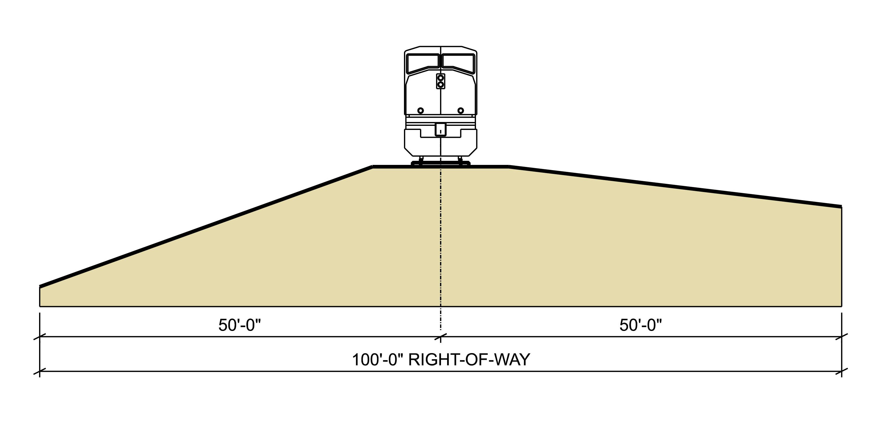
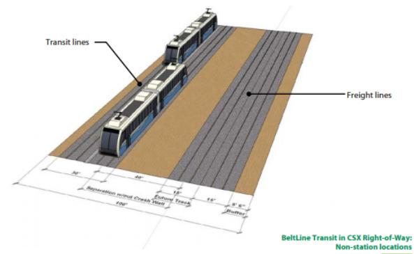
To start, here is the standard cross-section. It hasn’t changed since this 2005 drawing by EDAW for the 2005 Atlanta BeltLine Redevelopment Plan.

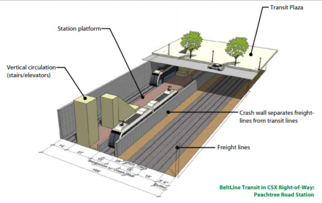
In 2010, a more detailed design was done to show how that cross section can work in different conditions. These cross sections came from the Atlanta BeltLine Corridor Design team, which was led by Perkins+Will:

Land use and transportation planning efforts always included transit in the railroad corridor and prepared communities for transit-oriented densities. Here are some images from the 2005 Redevelopment Plan.
At Memorial. (EDAW, 2005):
At Northside. (EDAW, 2005):

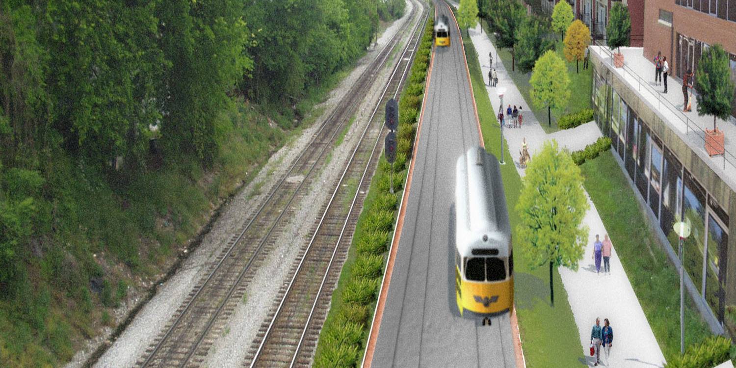
At Peachtree. (EDAW, 2005):
At Pryor. (EDAW, 2005):
At JE Boone. (EDAW, 2005):
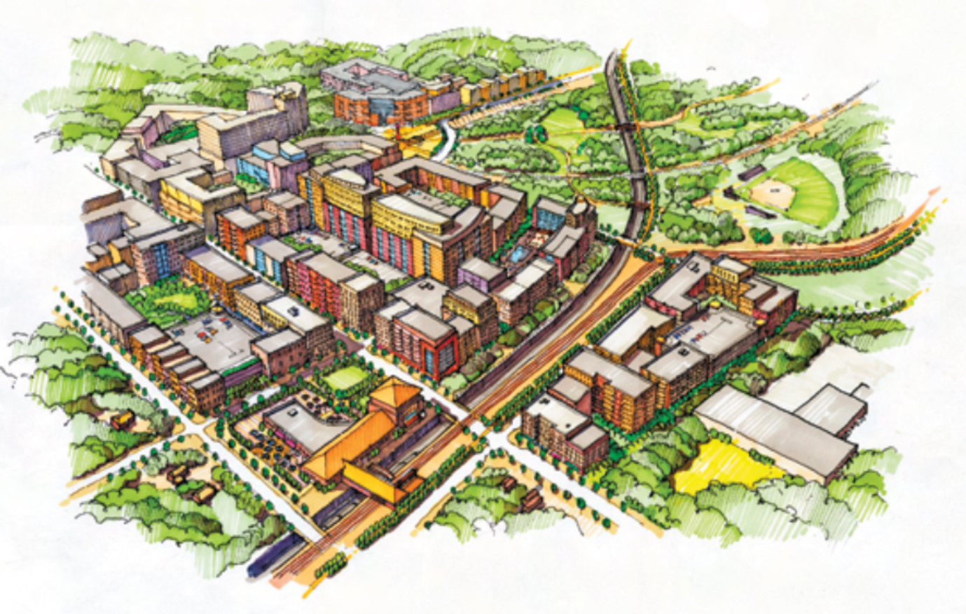
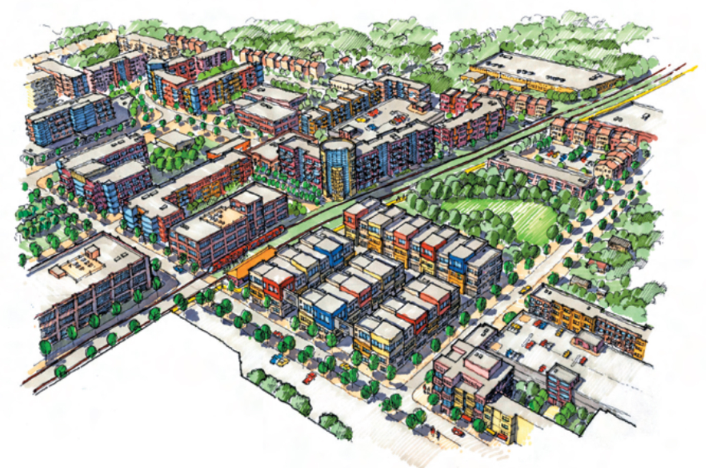
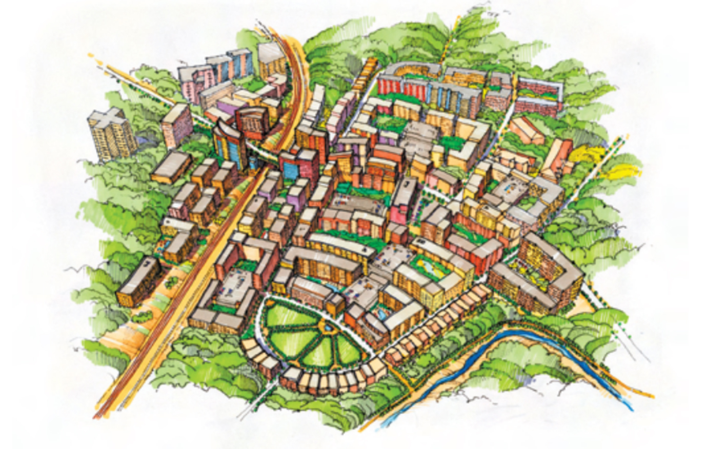
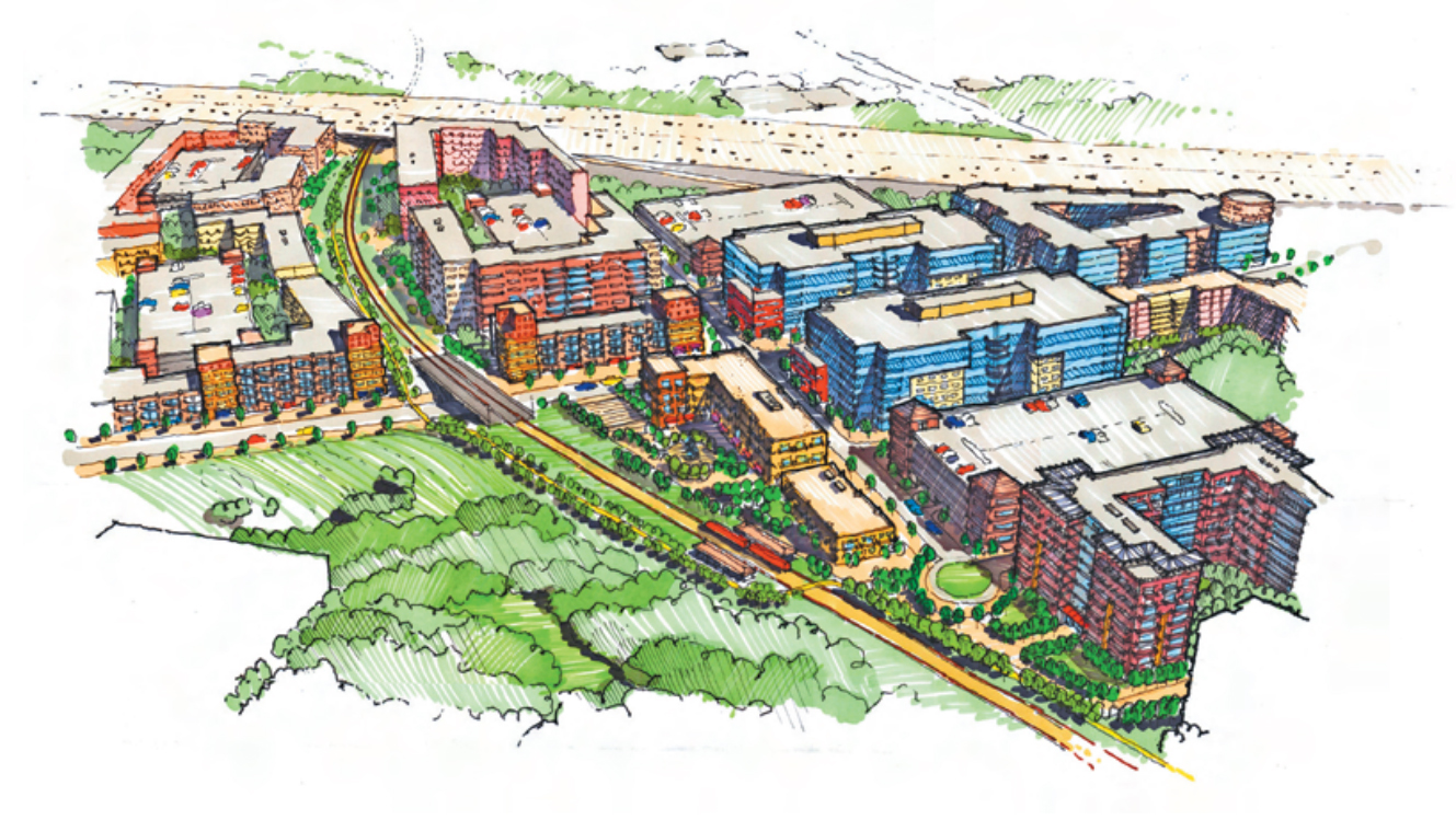
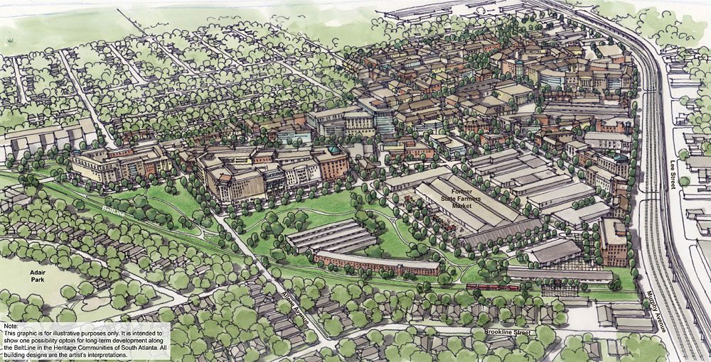
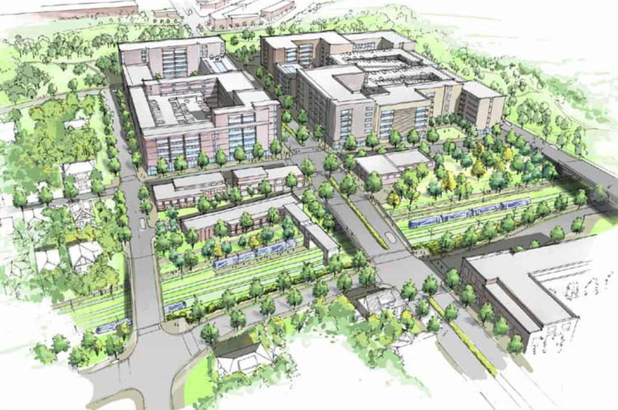
Following the 2005 Redevelopment Plan, ten Subarea Master Plans articulated more details about development in each community – and all assumed growth based on transit. Here are some images from those plans.
Subarea 1. (TSW, 2010):

Subarea 2. (TSW, 2009):
Subarea 4. (Ecos Environmental Design, 2011):

Subarea 5. (EDAW, 2009):
Subarea 8. (AECOM, 2012):

Subarea 10. (MACTEC Engineering and Consulting, 2010):
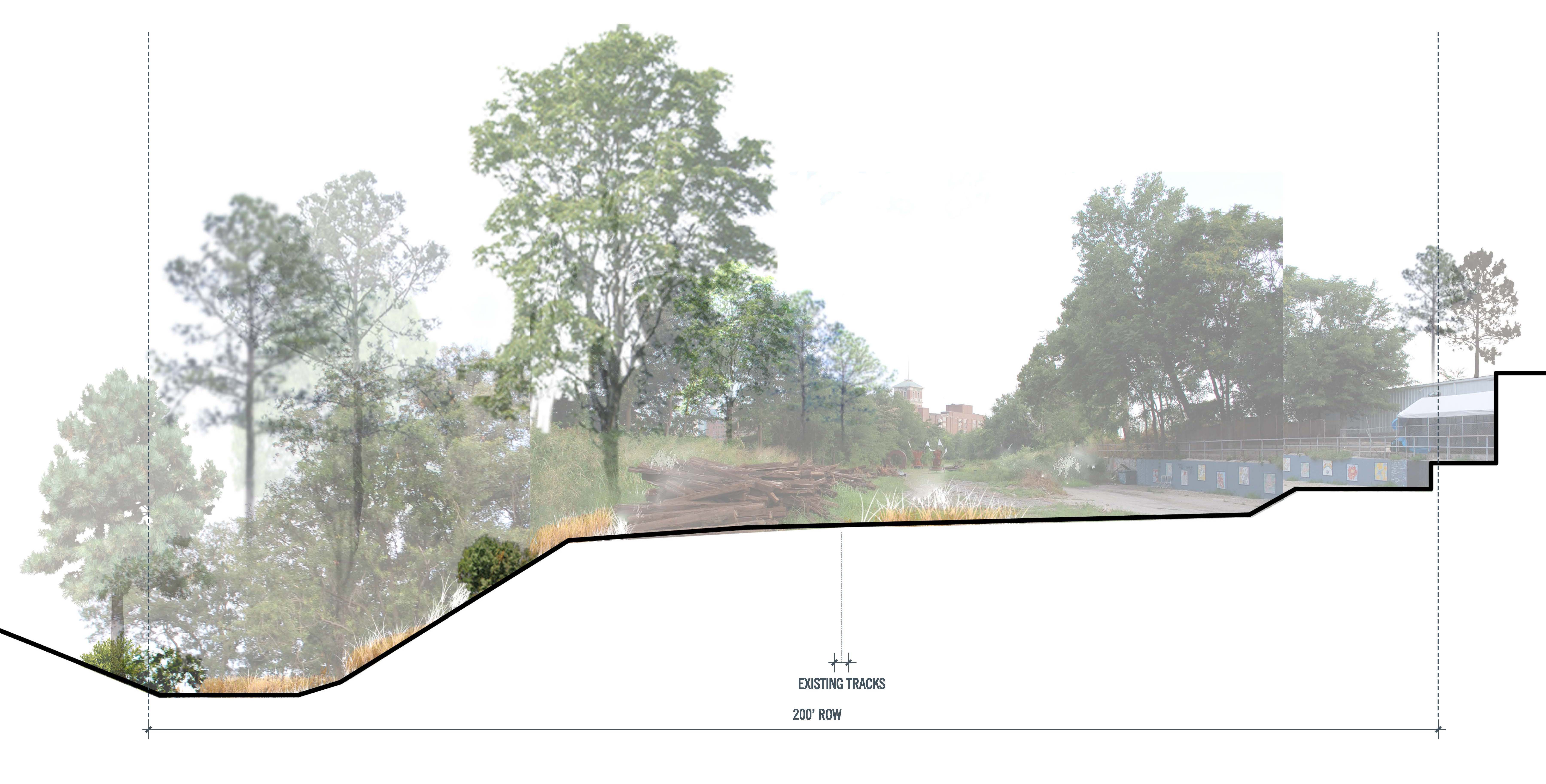
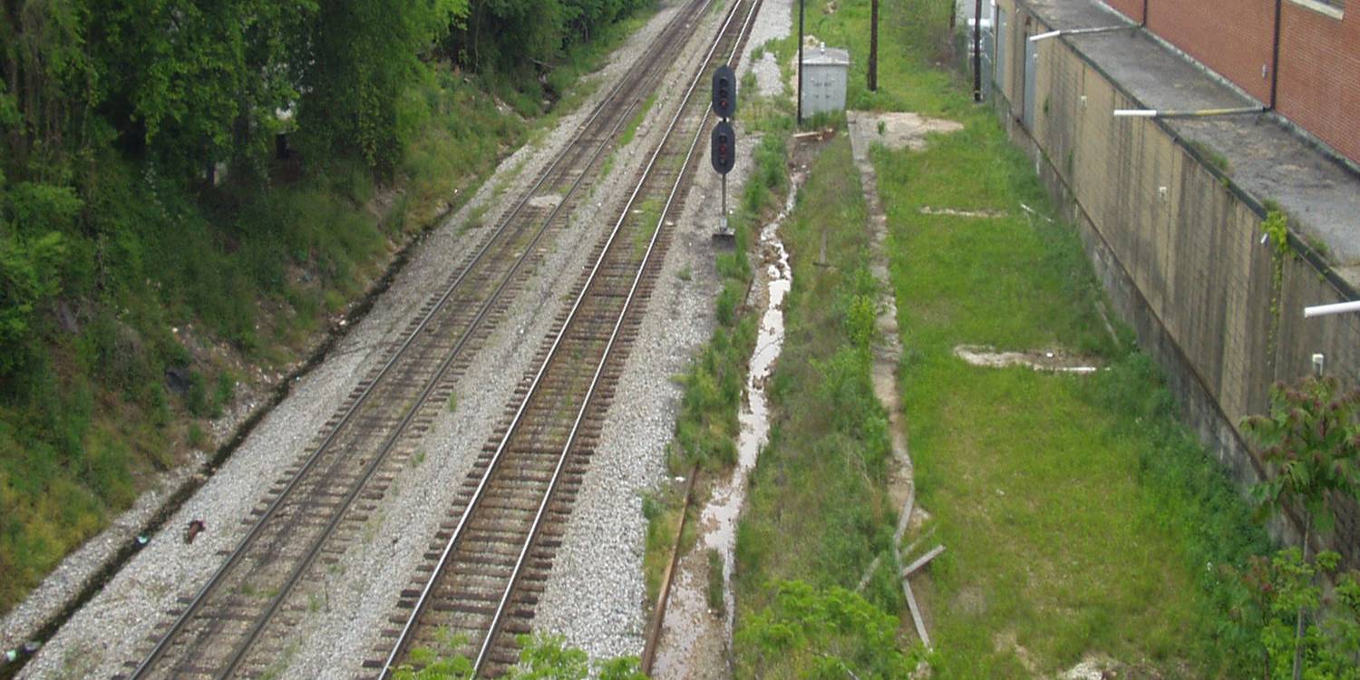
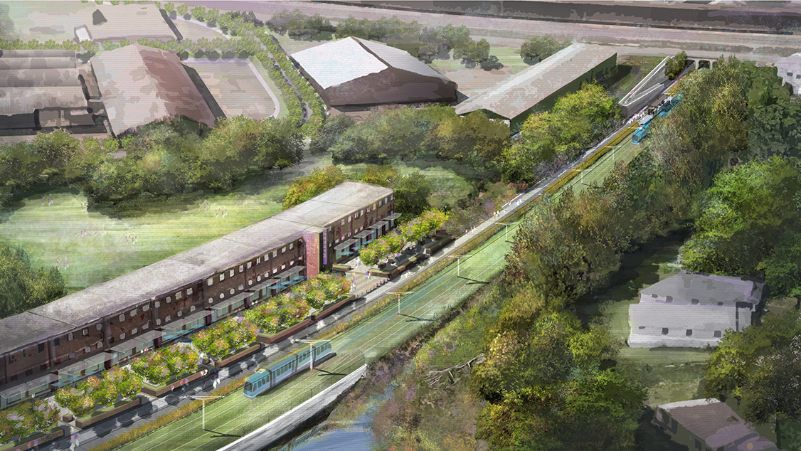
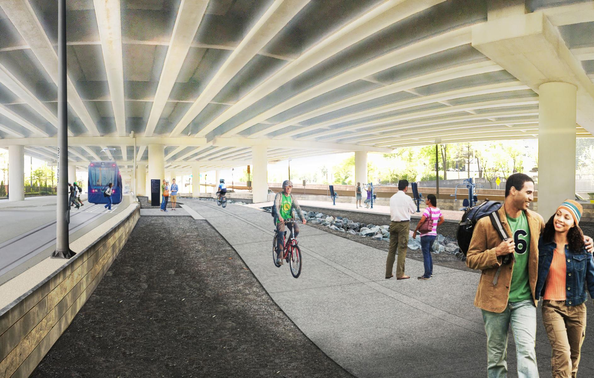
Of particular interest is the northwest segment of the Atlanta Beltline where active freight rail remains. These before and after sections show how transit works along this stretch. (Friends of the Belt Line, 2004):

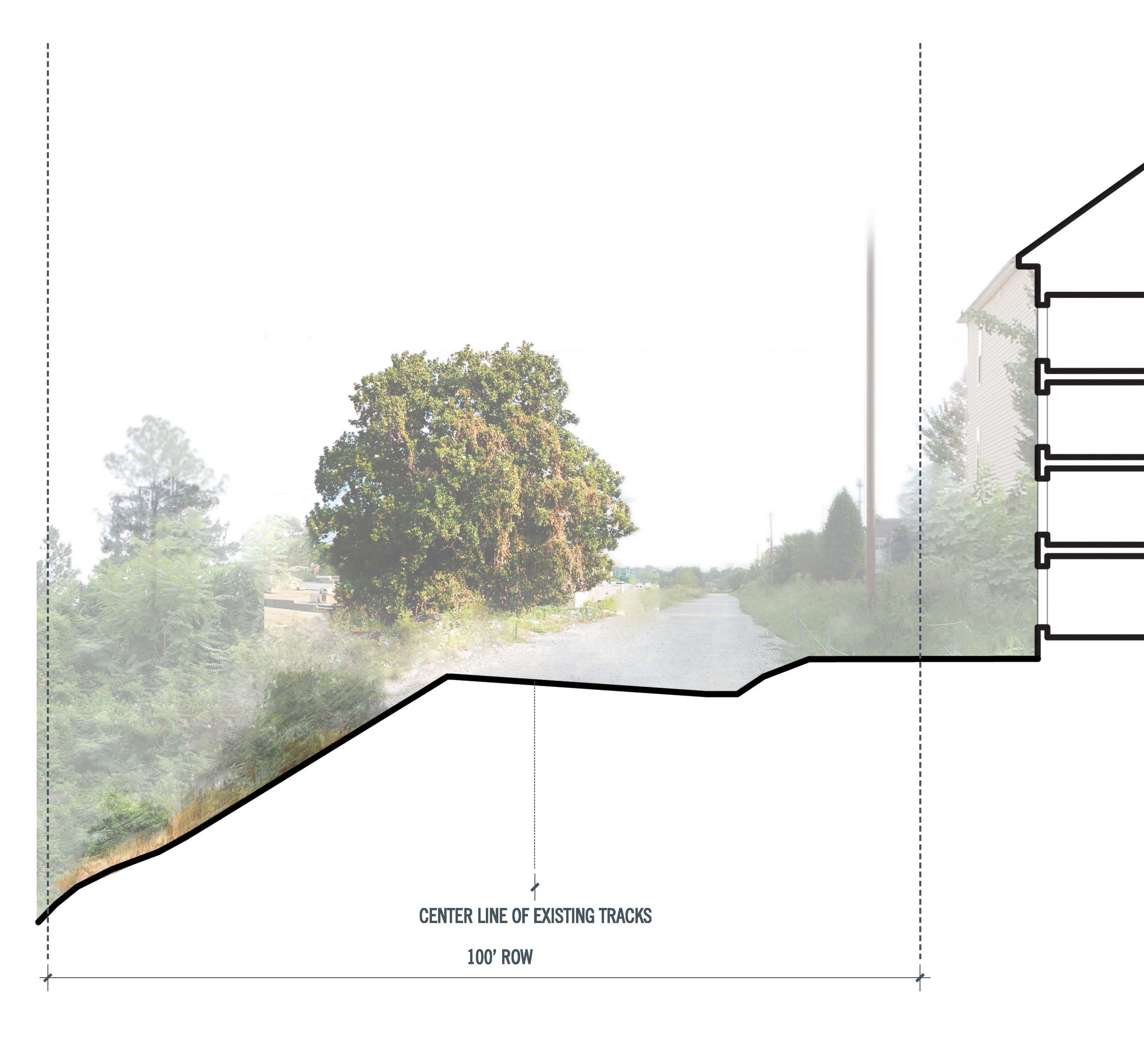
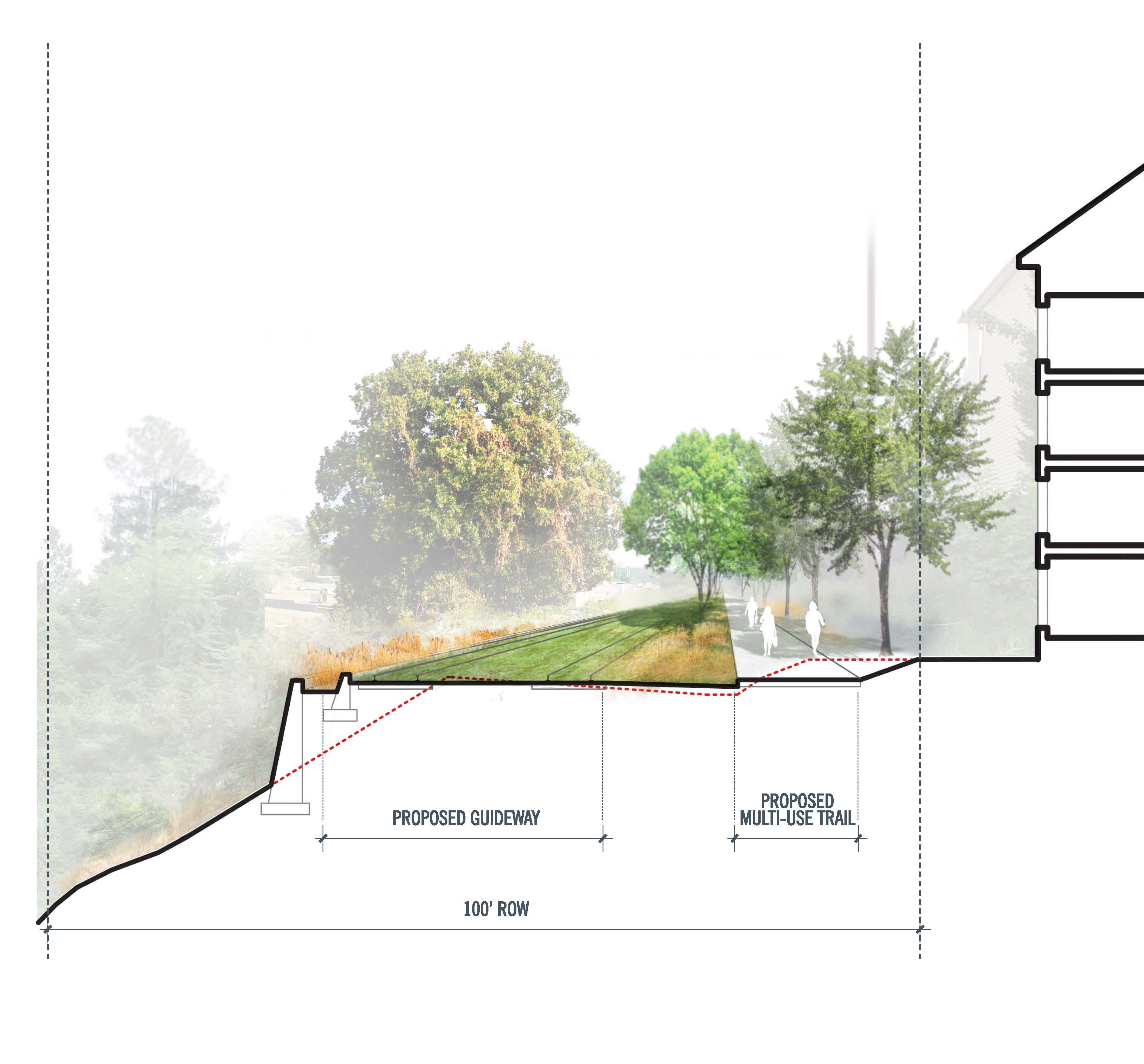
Also, here are before and after illustrations at Howell Mill Road from the 2005 Atlanta BeltLine Redevelopment Plan by EDAW:
And here are diagrams from the 2010 Subarea 8 Master Plan by MACTEC Engineering and Consulting:
Another place of particular interest is Hulsey Yard. It’s a challenge, but it’s basically a real-estate deal. (More here).

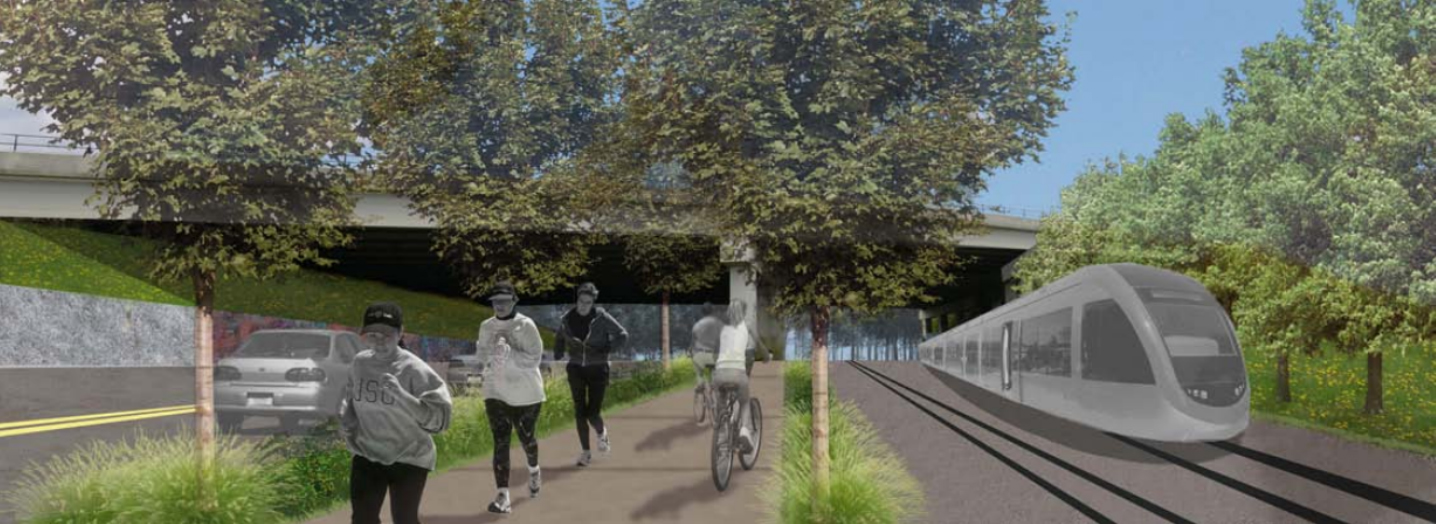
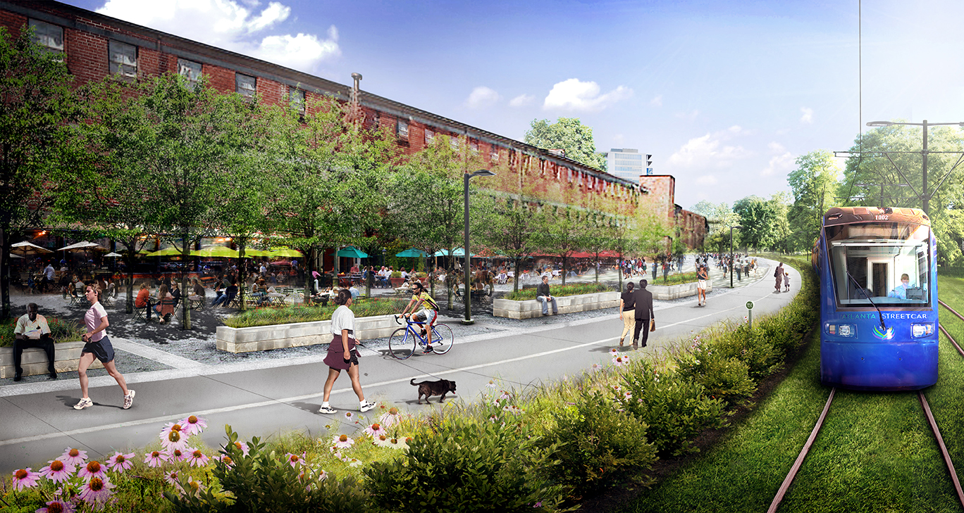
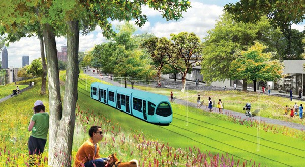
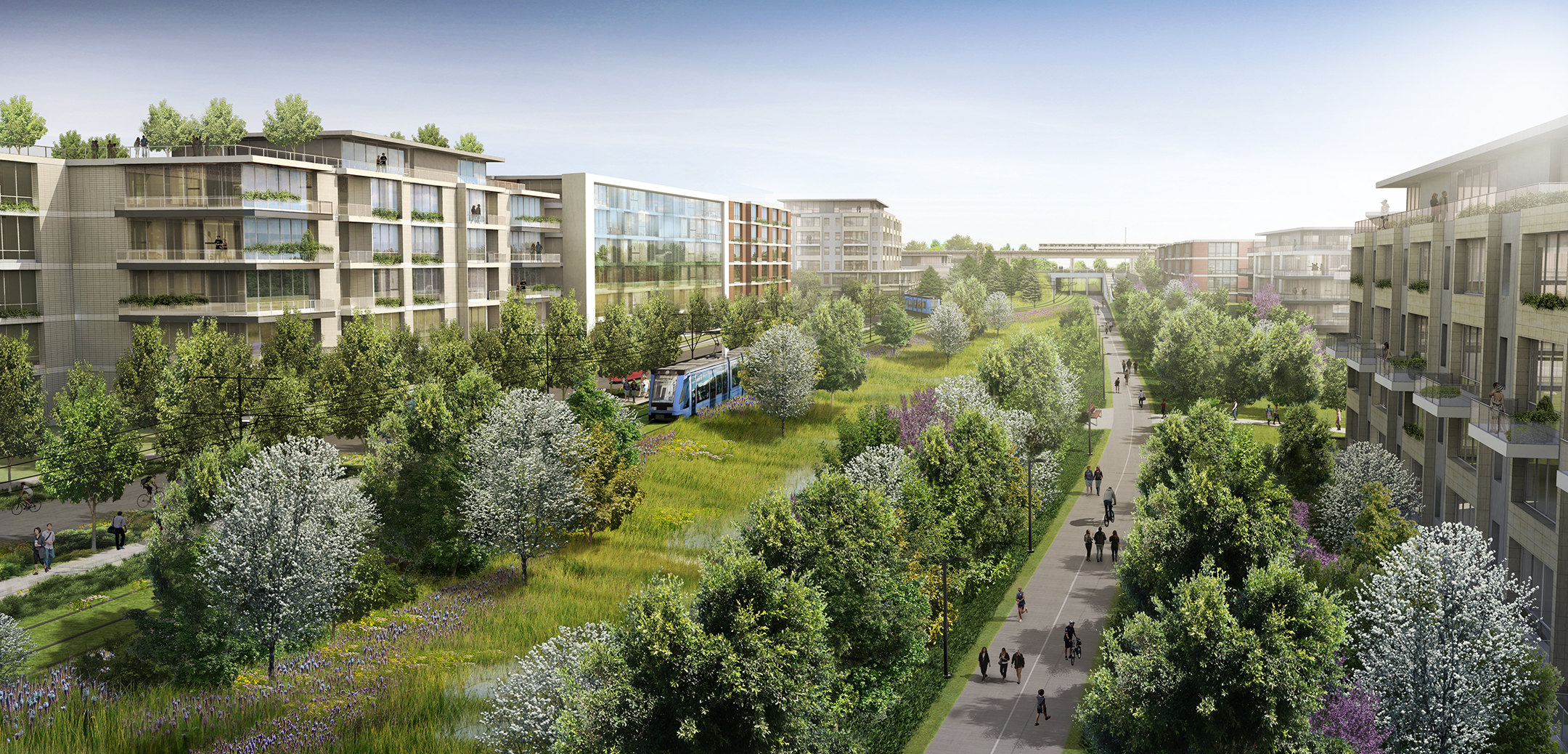
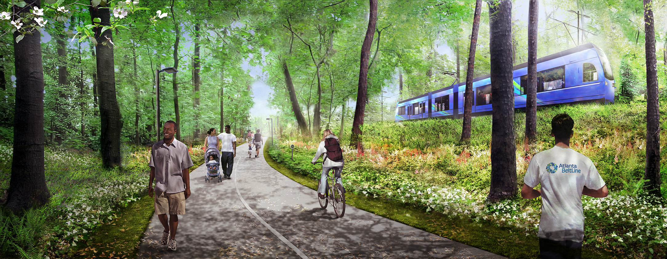
Starting in 2010, the Atlanta BeltLine Corridor Design provided the best illustrations of how transit fits alongside the trail.
At Allene. (Perkins+Will, 2014):
At Angier. (Perkins+Will/James Corner Field Operations, 2010):
At Donnelly. (Perkins+Will, 2014):
At Holderness. (Perkins+Will, 2014):
At Irwin. (Perkins+Will/James Corner Field Operations, 2010):
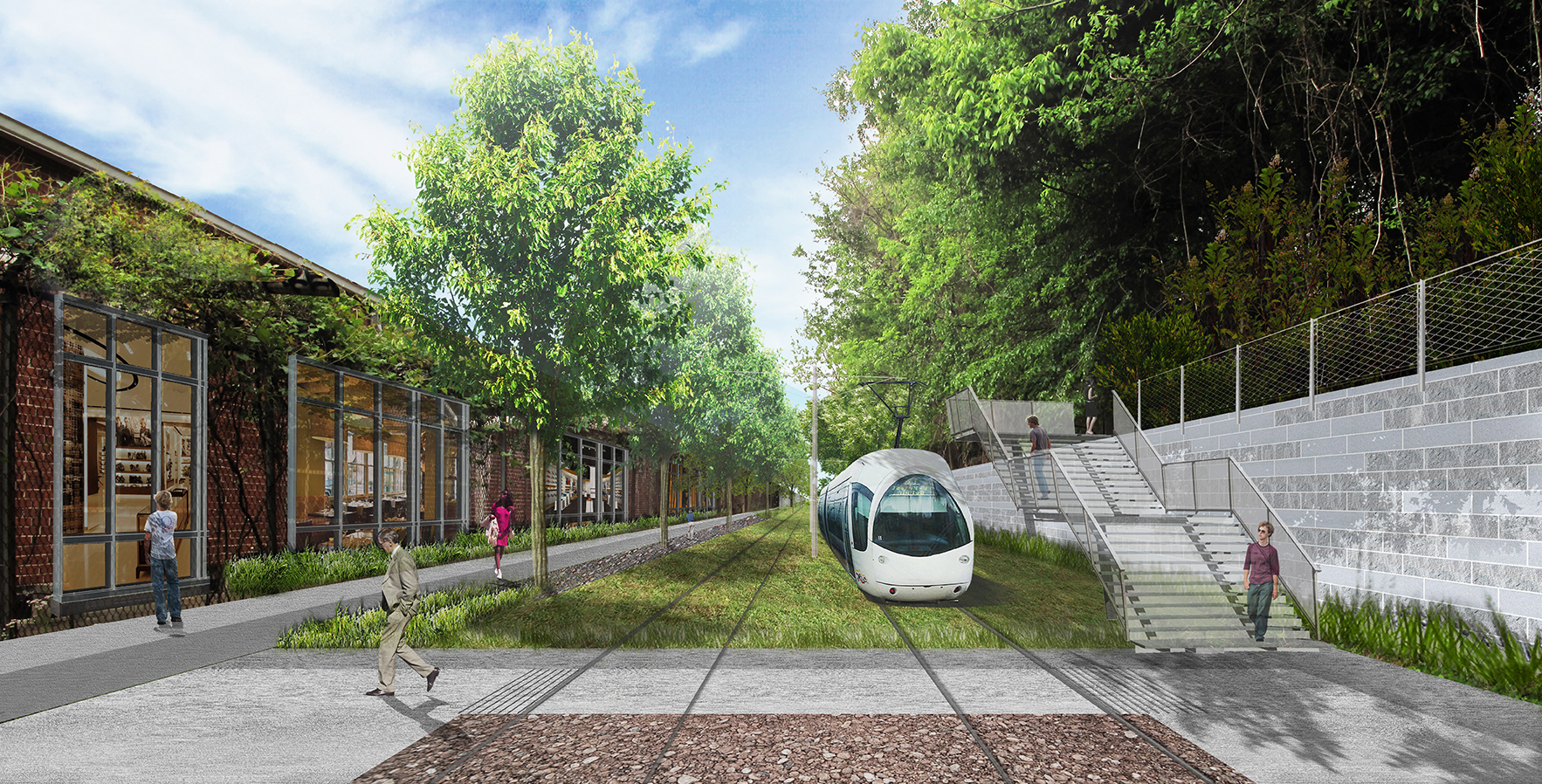
At Lucile. (Perkins+Will, 2014):
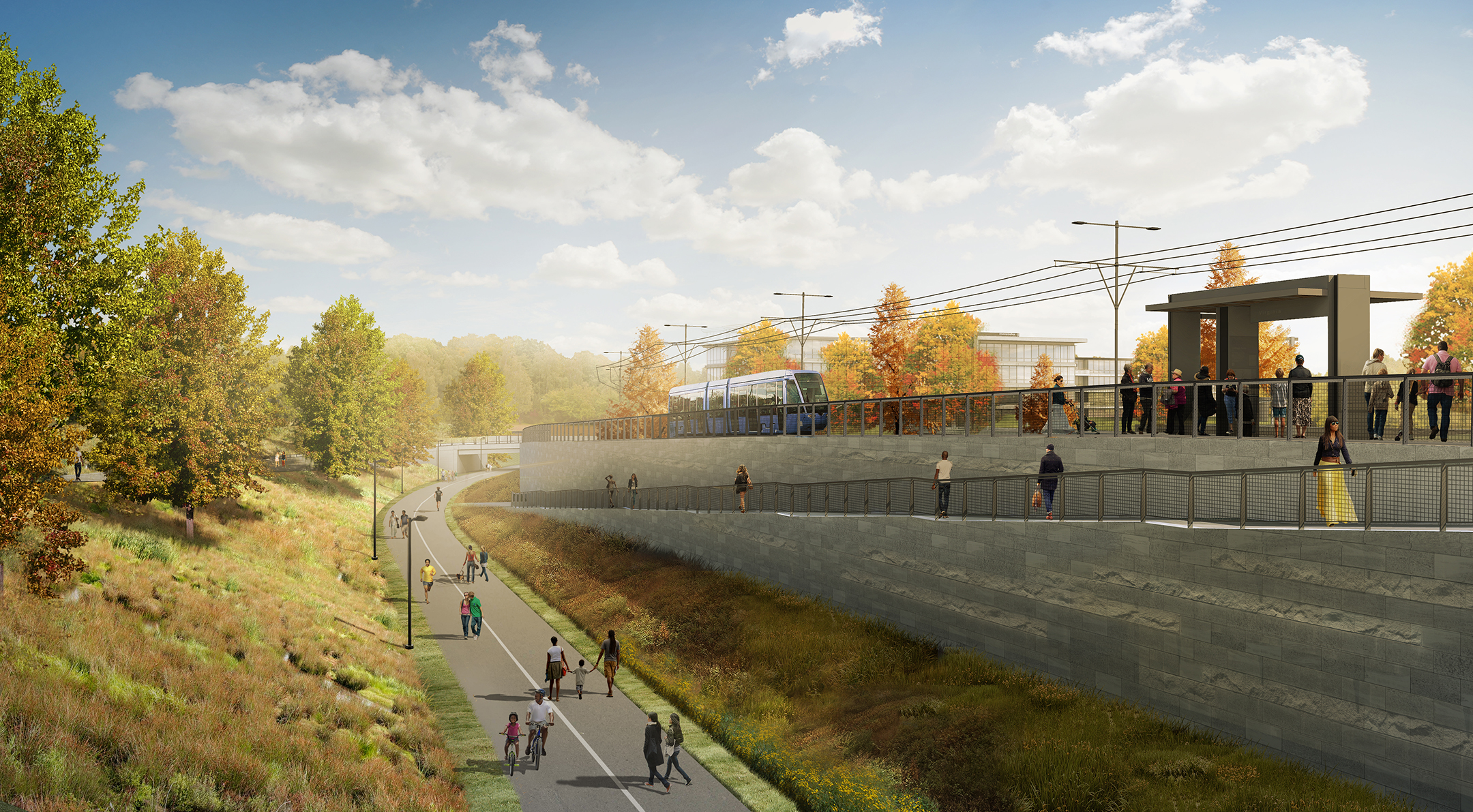
At Milton. (Perkins+Will, 2013):

AT Martin Luther King, Jr. (Perkins+Will, 2014):
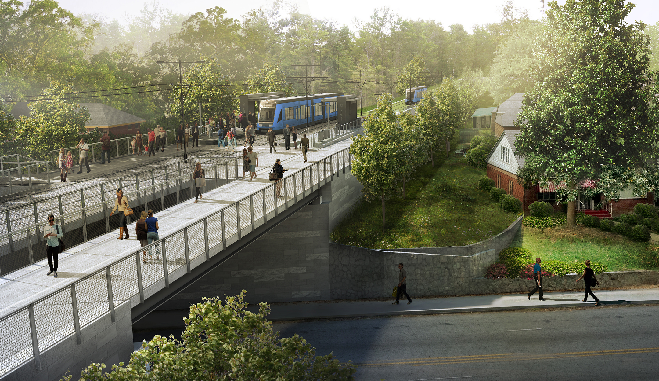
At Murphy. (Perkins+Will, 2013):
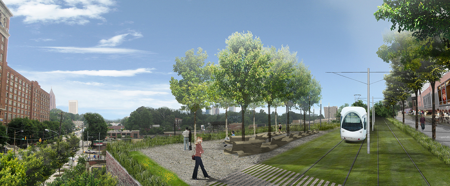
At Ponce. (Perkins+Will/James Corner Field Operations, 2010):
At Pylant. (Perkins+Will, 2013):

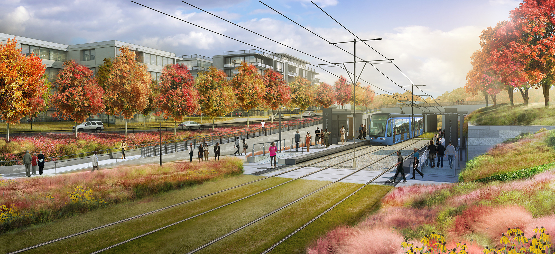
At Ralph David Abernathy. (Perkins+Will, 2014):
Here are some other images.
At I-85 North. (Heath and Lineback, 2018):
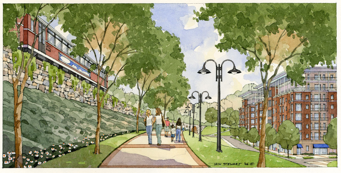
At Grant. (Iain Stewart, 2006):
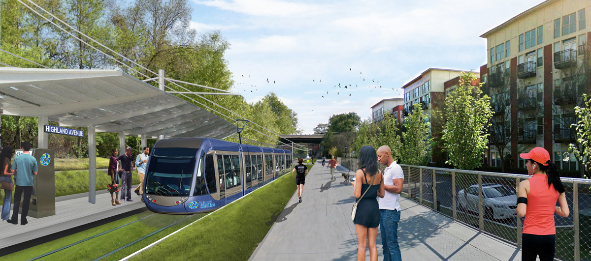
At Highland. (??):
Related > how these images fit into the history of transit and the Atlanta Beltline.
Categories: faq.
